Feb 23, 2018
Design of the "Breadwinner": Art director Reza Riahi talks about his process
Reza Riahi.
Cartoon Saloon's third feature film The Breadwinner, directed by Nora Twomey, is currently nominated for an Academy Award for best animated feature. The film's story, about holding onto hope within a harsh reality, called for two very different styles (a 'real world' and a 'storyworld').
Cartoon Brew sat down with the film's co-art director, Reza Riahi, earlier this month at the Anima festival in Brussels, Belgium, to discuss approach to designing the film and the creative choices that he made. (The film's co-art director was Ciaran Duffy.)
Four years ago, Riahi did a concept art test for The Breadwinner, in the midst of his graduation year at La Poudrière in France, and was chosen to be one of the film's two art directors. He ended up spending three years in Ireland, designing the storyworld sequences as well as designing characters, and even correcting details on characters' key poses during the animation phase.
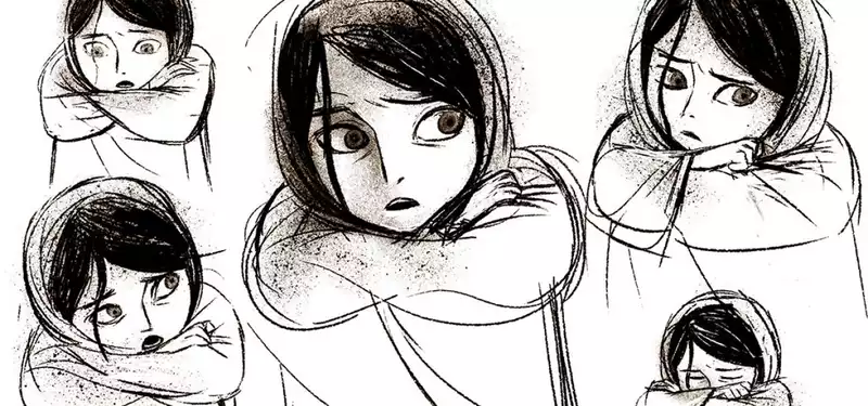
When it comes to the character designs, main character Parvana was designed with the strong straight lines that were used to design the rest of the cast. Her design was made to look appealing and idealized. “Parvana should be beautiful because she's the hero,” Riahi explained. “That's the animation industry…The thing with main characters is that you have to make everyone happy with [its design]. Everyone – producers, director, the audience, whoever. If they're not happy with it, they're not going to watch the film.”
More freedom was to be found in designing the secondary characters. “You can do everything you want with them,” said Riahi. Parvana's little brother became the most cartoony character, within the 'real world' that is, fitting with his function of cute comic relief and uplifting sad moments in the film. Designing the little boy was hard for a long time, Riahi recalled, until one day when Riahi's mom scanned childhood photos of him. There was the solution – he modeled the boy after his young self.
The character poses above were given to animators as reference, but the final animation design ended up having very clean lines. “I really wanted the sketchy thing,” Riahi recalled. “I didn't want something perfect.” But it wasn't possible to translate the charmingly sketchy lines directly to animation; it would be impossible to maintain consistency in a feature film, the art director explained, because so many different animators have to draw in the same style. The animators ended up working with extremely clean lines. Later, some imperfect-making effects were added in the compositing phase.
Completely opposite to the 'real world' sequences, the storyworld allowed for rich lines and textures, and unrealistic design. Even though the character rigs in the storyworld could've easily been rigged to include more angles than just front-view and profile, Riahi chose to embrace the limitations, which resulted in truly charming and funny animation. “Front views are just really expressive,” Riahi said. “If you don't need [something], you shouldn't use it.”
The color sketches below are just a few out of many that Riahi made during his three years on the film. “In meetings, my drawings were my language,” the artist explained. “When I wanted to talk about something, I'd just draw it.” He'd make five-minute color sketches like these all the time, “just presenting different suggestions” for others in the team to choose from.
The color red connects different scenes in the film; everything that concerns Suleyman, the main character's late older brother, is red. Many storyworld sequences are dominated by red, and it appears in the 'real world' as well sometimes, like when Parvana sells her sparkly red dress on the market with a heavy heart.
“The film is all about contrast,” Riahi stated. And so, whereas the colors of the 'real world' are muted, those of the storyworld pop off the screen.
Aside from color boards, the art director also drew 'light boards,' which are sometimes referred to as value studies. Regarding the artwork below, Riahi explained he was simply looking for ideas on how to use light and shadows. Without colors and with almost no outlines, he forced himself to really find out how to communicate the right atmosphere with light . A particular challenge in the film was figuring out how to handle the bright sunlight of Afghanistan.
After testing a watercolor style, one similar to Cartoon Saloon's earlier film, Song of the Sea, Riahi and fellow art director Ciaran Duffy went looking for something harsh and realistic, instead of dreamy and soft.
Since the crew couldn't visit Afghanistan itself, they used as many photo references as possible for background research. Riahi recalls being surprised at the little amount of color that was present in the area, unlike what he had imagined.
For the 'real world,' they ended up with a muted color palette that put the focus on the characters.
The inside of the family's home was also a challenge, Riahi recalled. The location had to be minimalistically designed because the family in the story is poor. At the same time, the walls had to be interesting enough to look at during the many conversations held in the home. Riahi and Duffy eventually found the right balance by combining rich textures and subtle colors.
Whereas the real world backgrounds of the film are naturalistic, the storyworld sequences are flatter and quirkier. In the storyworld sequences, the composition and lighting become quite theatrical. “These sequences give the audience some light – some fun – in a harsh film,” Riahi explained. “Its design makes the film's story more bearable.”
Cartoon Saloon is currently working on an art of book about The Breadwinner. Its release will be announced at a later date.


Post your comment