Feb 5, 2024
Designing an Annie Award-Nominated Series: This Year's TV/Media Production Design Nominees Share Their Tricks of the Trade
Many festivals and award ceremonies honor animation projects, but only a handful, like ASIFA-Hollywood's Annie Awards, honor the individual achievements of the artists who created them.
Voting opens today for this year's awards, and we celebrate the occasion with a closer look at the Production Design (TV/Media) category. We asked the nominees to send in their submissions to Annie's and talk about their role in the design of these visually striking programs.
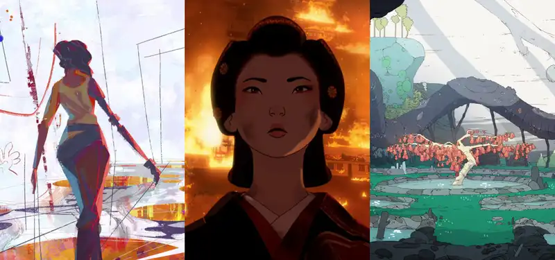
Nominees included Toby Wilson, Jason Scheier, James Wilson, and Emil Mitev for Blue Eye Samurai, Carlos Salgado for Star Wars: Visions, Scavengers Reign Charles Huettner, Jonathan Djob Nkondo, Pauline Mauvière, Hugo Moreno, and Jon Juarez for "Scavengers Reign. Marvel Studios' "What If...? -" was also nominated, but no assets were submitted for this article.
Episodes "Hammerscale" and "The Great Fire of 1657"
Nominated: Toby Wilson, Jason Shire, James Wilson, Emil Mitev
Toby Wilson, Production Manager: First and foremost, this work is set in the beautiful indigenous culture and setting of 17th century Japan. It all began with in-depth historical research. Our goal was to be true to the Japanese culture of the time and to visually portray that period. Next, we needed to use ukiyo-e, the Japanese artistic representation of the period, to achieve this goal. Specifically, we drew on the work of Hiroshi Yoshida, who incorporated Western artistic sensibilities into Eastern art. The perfect fusion of East and West was just like "Mizu."
Third, I wanted the composition and lighting to have the feel of a live-action film.
This means designing and building historically authentic sets, filming the story as one would with a film camera, using a naturalistic approach to lighting and color choices, and applying a stylistic ukiyo-e treatment to the way scenes are drawn and characters are lit.
As we began the look/development of the show, we wanted to maintain a 2D look for the characters in order to create an ukiyo-e-like atmosphere. This meant minimizing the amount of form lighting and stylizing light effects such as reflections and highlights. For the background, in addition to reflecting the painter's brushstrokes in the image, we utilized the Japanese design principle of "no-tan" to design light, dark, contrast, and textures of specific shapes, intentionally focusing on the areas in focus in the shot.
Episode "Sisu"
Nominated: Carlos Salgado
Carlos Salgado: The main challenge with "Sisu" was to convey the abstract power of imagination in a cohesive and unified way, supporting the characters' journey. We drew inspiration from elements of abstract painting, incorporating the vibrant colors of iconic artists such as Picasso, Miró, and Sam Francis. Adopting a bold and inventive painterly approach, UPA was humbled to redefine graphic style with modernist cartoons
and to use the same approach as the artist's own work.
Under the clear direction and vision of Rodrigo Blas (director and screenwriter), the script gave us the freedom to take risks and experiment, allowing us to discover our own visual language. On the technical side, the collaboration with Jonatan Catalan (DP, Lookdev) and his team proved essential in seamlessly translating these diverse aesthetics into the final animated story.
It was incredible to be a part of a project with such creative freedom, especially when trying to bring something unique to the vast Star Wars galaxy. Working with a small but extremely talented art team, including Linda Chen (character design) and Pablo Dominguez (concept design), I feel great pride in the work we accomplished.
Episode "The Storm"
Nominated Charles Hüttner, Jonathan Dijob Nkondo, Pauline Movielle, Hugo Moreno, John Juarez
Charles Hüttner Scavengers / Scavengers The visual design of Reign was inspired by a number of sources. Some are easy to understand, such as "Nausicaa of the Valley of the Wind," "Mobius," and old cartoons like "The Magnetic Rose. I also looked at a lot of microscopic pictures. I had a big picture folder full of pictures of animals doing weird things and electron microscopes. After all, there is nothing more surreal and interesting than nature.
We also tried not to overwhelm the viewer.
Alien landscapes are, at first, difficult to accept. Therefore, it was important to strike a balance between showing strange structures and showing something understandable. To accomplish this, we often used the natural language of the earth, but twisted it in unique ways to provide what the characters and story needed. In addition to this, our designs were often created using some sort of internal logic of how they would exist in their environment. Concept art was often accompanied by a brief description of the life cycle and purpose. This approach was very helpful in bringing the world together. I think about that every time someone tells me that the world of Scavenger's Rain feels alive. I'm very proud of the entire design team, and I'm very proud of the way they worked together to bring the world to life.
.


Post your comment