
Mar 3, 2023
Building Visual Style in Short Films: This Year's Oscar Nominees Tell Us How
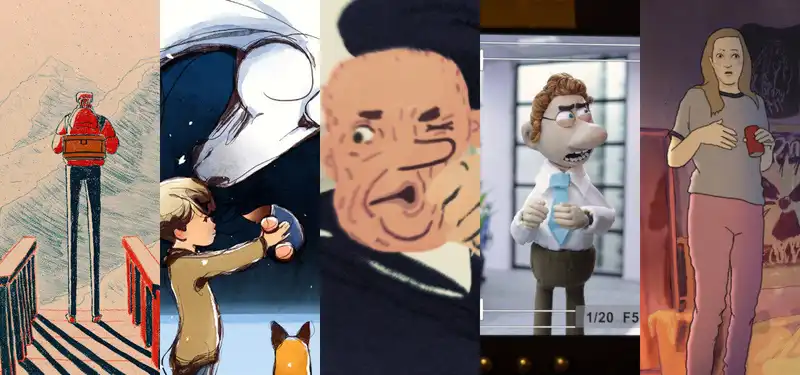
Voting for the Academy Awards opened yesterday, and to mark the occasion, we interviewed the makers of five of this year's nominated animated short films: Ice Merchants, The Boy, the Mole, the Fox, and the Horse, The Flying Sailor, An Ostrich Told Me The World Is Fake And I Think I Believe It, and My Year of Dicks.
We asked them to talk about the development of the overall visual style of their films and explain how the stories influenced their development. This story builds on an earlier story in which we interviewed the same filmmakers when the shortlisted films were first announced about the inspiration behind their stories, what they learned when making the films, and further dialogue about the graphic style of their films. It is a complement to the previous story.
Voting for this year's Academy Awards will continue through Tuesday, March 7, with the awards ceremony taking place on Sunday, March 12.
Director João Gonzalez
João Gonzalez The overall style of my film is deeply influenced by the way I illustrate graphic diaries, which I have always loved. I love architecture, and for a long time I even considered it as a profession. So I was always interested in using perspective and paying special attention to backgrounds, and reflecting that in my films. Strong dark shadows and a limited color palette have also always been a favorite of mine, and my concern as a filmmaker is to try to find ways to incorporate aesthetically pleasing aspects that I like in a way that is conceptually beneficial for the film. As for the use of perspective, I think it was important to convey a sense of vertigo and scale of the place where father and son live. I think the shadows add a dramatic feel that fits the story of the film. And when it comes to the film's limited color palette, it was very important for me to contrast the warmer, more "human" and lively colors of the characters and their home (reds, oranges, yellows) with the more "harsh" and cold colors of the horrific environment they live in (dark blues and beiges).
Charlie McKessy and Peter Bainton, directors
Charlie McKessy and Carla Speller, producers: We wanted to emulate the book, so the style of the film was as close as possible to the look and illustrations in the book. But we wanted to develop it beyond the book and make it sort of cinematic and more immersive as an environment. The story is a gentle, peaceful tale, and I wanted to follow that emotion visually. But I wanted the world to build as the characters became more connected throughout the film, so as their relationships deepened, the visual style became fuller, richer, and more detailed. We wanted to maintain the stillness and all the negative space of the book's artwork and reflect that in the film. In other words, we needed to maintain moments of stillness, moments to pause for thought. Also, in terms of changing the pace of the storytelling, I reduced the number of shots and cuts, and increased the amount of lingering space for each landscape and environment. There is not much camera movement either. All of this came about as a development from the book.
Wendy Tilby, Amanda Forbis (director)
Wendy Tilby, Amanda Forbis (director): To establish the shape and pacing of the story, I used all kinds of drawings, painted abstract fragments, and recorded footage to create the first We created animatics. We were drawn to the gritty, grainy realism of photographic images and excited by the possibilities of a mixed media approach. Particularly inspired were the aerial shots of the huge plumes, and we quickly realized that 3D was the right way to capture the depth and ferocity of the blasts. working with Maya artist Billy Dyer, we had a lot of fun creating a "model train" version of the Halifax. We also kept some of the live-action clips (and shot others). The sailors were animated in CG, but rendered in the usual 2D painterly style. Aesthetically, we aimed for a hand-drawn vintage postcard look and put everything together using After Effects. The whole process was highly experimental and much more complex than we had initially imagined.
Director Lachlan Pendragon
Director Lachlan Pendragon In animation, I think the visual style helps to enhance and get into the story. In my films, the story pokes fun at that artifice and deconstructs the stop-motion animation process. In other words, my visual style could be used to emphasize the handmade and tactile qualities of the film and to influence the story in humorous ways, such as when the doll's face falls off and the main character notices. These meta gags were really fun to write and I am happy with the finished product. The most noticeable aspect of the visual style is the glimpse of the animation process at the edges of the images shown through the external camera monitors. I wanted the audience to feel like they were in the room with the animators, experiencing the film as one long frame-by-frame shot.
Director Sara Gunnarsdottir
Sara Gunnarsdottir: Over the past decade, I have created many animations within live action films ("The Diary of a Teenage Girl," "The Case of Adnan Syed"). I have therefore developed a working method of filming reference footage of myself and my husband (Ethan Clarke) for the characters. This seemed like a good way to work on character designs that would represent the real people and actors we were seeing in the photos as well. What I like about this method is that the impact of the poetry really hits home the moment you step away from the reference and the animation takes off. When I read the script and saw that Pam (Ribbon) had put a different genre of film on each chapter, I immediately thought of my favorite animation artists and friends who would give each chapter a great animation style. Eight of us made this film together.
Having such a small and talented group allowed me the freedom to approach the characters as I saw fit. I wanted everyone to feel that the loose rotoscoping process would allow them to showcase their own artistic style outside of the genre sequences. I believe it gave Pam a sense of abstraction, heightened her emotional side, and helped us see her as a real and complex person. In designing the show, I wanted to create an engaging, painterly world that reflected a sense of looking back on her teenage years, but that also reflected the young Pam firmly in the present. My hope is that the visual artistry of the film will push the core of the storytelling and highlight its more vulnerable aspects. This approach of having each chapter represent a specific genre made it fun and easy to develop a strong visual aesthetic for each chapter. The animation style as well as the color, layout, camera work, music, and general tone and mood helped to intensify the emotional lift of each chapter.
.
Post your comment