
Mar 22, 2016
6 "Inside Out" Story Painting Lessons Learned by Artist Matt Jones from Ronald Searle
Ronald Searle has often been called one of the greatest graphic satirists of the twentieth century. Born in 1920, in Cambridge, England, he became that country's most famous cartoonist after the immense success of his St. Trinians characters - morbid tales of evil schoolgirls torturing their teachers, borne out of his own horrific experiences as a British soldier held prisoner of war by the Japanese during World War II.
Searle's subsequent work in Europe, and later America, made him one of the most influential cartoon artists on the planet, and everyone from Matt Groening and John Lennon to Chuck Jones and Tim Burton have recognized his work as an inspiration.
My new book, Ronald Searle's America, is the result of a decade's worth of studying and collecting Searle's art, as well as a tribute to the man I got to know in person in the years before his death. Becoming intimately familiar with his work has informed how I approach my own artwork, both professionally as a story artist working in feature animation, as well as in my personal artwork. Here are six key lessons I've gleaned from Searle that working professionals and students alike can apply to their approach.
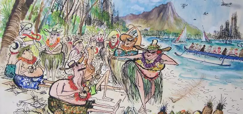
There's no substitute for observational sketches to inspire gags or scenarios that one wouldn't normally conceive of from the imagination. For example, here is a drawing Searle made for a report on Provincetown for Holiday magazine in 1962.
The loose sketch made on location sparked the gag idea, which is developed further - adding and subtracting elements along the way (a third figure on the left, the items in the windows, the dog etc.) - and worked up into the final picture.
The chapter on Provincetown in Ronald Searle's America reveals Searle sketched dozens of locals and buildings, and even kept clippings of amusing small ads in the local newspaper. He noted anything that amused him which might in turn trigger the idea for 'the gag.' Searle's drawings may give the appearance of looseness and spontaneity, but the artwork was more often than not the result of thorough exploration in thumbnail drawings, followed by several larger roughs, and sometimes multiple versions finished in ink.
Observations from life were key to Searle's success. His assignments during the golden age of reportage illustration for magazines afforded him the opportunity to travel the world and meet people from all walks of life. His art school training had instilled in him the habit of keeping a sketchbook with him at all times.
When I visited him in his studio he had shelves of sketchbooks from his entire career, all dutifully hand lettered on their spines. He had invested decades of sketching from life - architecture and figures and animals - which became an invaluable mental resource when working from his imagination. He could recall details, or a field note would help spur a memory of a specific detail that he could then exaggerate. He constantly searched for the humor in situations and the absurdity of human behavior. His work is underpinned by so much observation and practice that when he distorts figures and architecture it still works.
Searle was a magician when it came to arranging characters and elements within the frame. His complex compositions are underpinned by strong vertical and horizontal lines, and often a diagonal running through it. He used negative and positive space, and areas of dense detail are balanced by blank areas.
In 'Manhattan on the Rocks' for Venture magazine (October 1966), Searle parodies the pitfalls of modern living in the big city. Look at the image to see how he layers information.
There are five scenarios occurring in the drawing:
Searle's posing is quite different to animation layout or storyboard posing. They don't have quite so much believable weight and momentum. He, of course, had to communicate in a single image, but his poses are always specific and unique to each character. He never used stock poses, but rather, clear and readable poses that draw the eye and are, above all, funny.
They're not instantly 'gettable' like animation poses, but require a little work from the viewer to find the gag. The audience is expected to fill in a certain amount of the gap, which is rewarding for us. In terms of pure drawing, Searle was a master of graphic tricks - the fold of neck skin over a collar, the creases under a depressed chin, the wrinkle in a suit opposite a pointy elbow- visual cues we see influenced everyone from Disney animators Milt Kahl and Andreas Deja to MAD magazine's Mort Drucker and Jack Davis.
We can observe Searle drawing in this YouTube clip (6:16 mark):
Note how he uses his fountain pen unconventionally, upturned with the nib bent. He has a thoroughly roughed in pencil sketch, then works quickly over that in ink, maintaining a spontaneity in the line - 'stitching' as he moves his hand, creating that recognizable jagged quality.
In the finished drawing the pen lines are contrasted with much bolder lines most likely made with a brush. The dark wash of the night sky contrasts with the figures lit by firelight and makes the figures 'pop.' The horse is subtly toned darker as he turns away from his annoying human partner. His drawings hang together with great appeal, creating a satisfying visual experience for the viewer.
Searle's prolific output was driven by a genuine love of drawing and a rigid work ethic. He kept a meticulous deadline chart on his studio wall detailing the multiple assignments he was juggling at any given time. Art directors attested to his unfailing ability to meet deadlines and thorough exploration of the brief. He often submitted multiple finished variations on a theme for them to choose from. Even in his late-eighties he continued to work diligently. His wife, Monica, complained that she never saw him as he spent up to 11 hours a day in his studio.
He also held an appreciation of the history of cartooning and caricature. The walls of his Provencal home were decorated with drawings and prints by George Cruikshank and James Gillray. He held many of his contemporaries in high regard especially the cartoonists of his adopted Franc - Roland Topor, André François, and Sempé among them. In his youth he was influenced by the Germans, Otto Dix and George Grosz. During my research for the book, I found a fan letter he wrote to Saul Steinberg professing his admiration of his work and appealing for a drawing swap. Cultivating a familiarity with the art of the past is a valuable learning tool. Searle combined all of these influences to develop his inimitable style.
A drawing isn't funny and won't make the viewer laugh unless you laughed yourself while making it. Be silly; don't rely on drawing formulas. Think around a piece of business - explore ways to make it funnier. Think of humorous situations in life and channel that. Searle had a tough life early on, but laughing and drawing (and champagne) kept him going into his nineties!

Post your comment