Sep 20, 2023
2024 Academy Award Nominee for Best Short Film: "Remember How I Used To Ride A White Horse," directed by Ivana Bosniak Volda and Thomas Johnson Volda
Welcome to Cartoon Brew's spotlight series highlighting animated short films that have qualified for the 2024 Academy Awards. There are several ways for a film to qualify for an award. In this edition, we will focus on films that have won an Oscar-eligible award at a festival that is eligible for the Academy Awards.
Today's short film is Remember How I Used to Ride a White Horse, the third film co-directed by Ivana Bosnjak Volda and Thomas Johnson Volda. Produced by Croatia's Kreativni Sindikat, the film won and qualified for the Vienna Short Film's Animation Avant-Garde International Competition.
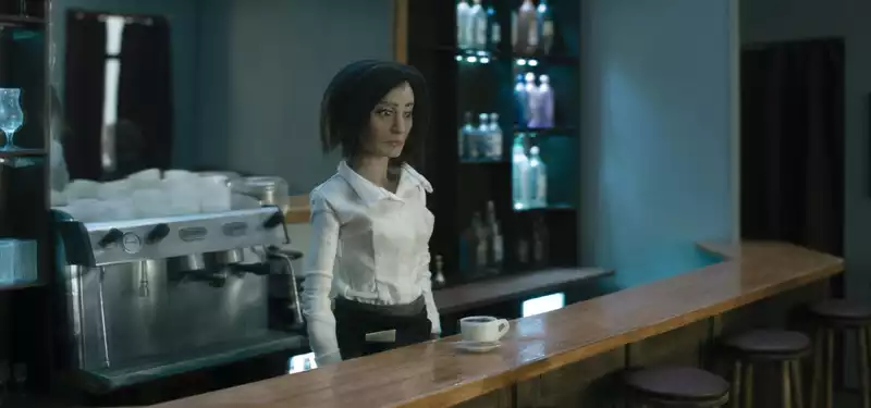
This stop-motion short features a waiter who feels trapped in his daily routine. The bleak color palette and clever camerawork create a sense of unease shared by the well-designed character and the audience.
Cartoon Brew: The distortion and vibrations in the backgrounds really add to the creepiness of the film. Where did you get the idea to use this technique and did you have any difficulty executing it?
Ivana Bosnjak Volda and Thomas Johnson Volda: Our intention from the beginning was to create this heightened atmosphere of unease in the film. As a visual metaphor, the vibrations of the stage design became for us a representation of the instability of the protagonist's consciousness. The initial idea was that the physical world around her was changing in time while she was stuck in a lethargic state. The shot offsetting the character's steady animation and the oscillating background took many passes of animation. Several passes were made, first with steady animation of the character, then without puppets, with the entire set of the café moving. The set is on casters and moves back and forth on motors with pistons. The characters were then composited with layers of vibration in post-production. Composing this set in the first place was difficult, but essential to capturing the effect on camera.
The initial concept of the film was inspired by our common feelings of apathy and melancholia brought on by not knowing or finding a way forward. These feelings have plagued us both and have hindered or completely disabled our creativity. We wanted to infuse these emotions into our characters and create a film that communicates these seemingly incompatible traits. We decided to create a more minimalist background film that removed unnecessary visual clutter and focused on the moods and emotional journeys of the characters. In many ways, this is our most personal and self-reflexive film.
What did you learn through the experience of making this film, either in terms of production, filmmaking, creativity, or subject matter?
Remember How I Used to Ride a White Horse is the third film we have co-directed, and I think our practical skills have visibly improved compared to previous films. However, as well as our skills in model making and stop-motion animation, our approach to narrative and creative concepts has evolved over the course of making these films. This film was particularly poetic and introspective, and challenged us to move further away from traditional narrative structure. Being honest in the films and confronting our inner selves through the production was not an easy task. Perhaps it was the sense of loneliness and isolation that heightened the film's themes. Nevertheless, we learned to find our creativity, especially when animating characters struggling with apathetic situations. I also learned that sugar does not flow well through the jar due to the heat of the studio lights, but that salt can be substituted.
Tell us about how you developed your visual approach to this film and why you settled on this style/method. Some images have been created over a long period of time. Often it feels like we are trying to recall a film that already exists somewhere in our shared consciousness. A dreamlike, emotional atmosphere was a central motif that guided the visual design of the film. The rich, overwhelming detail usually associated with the stop-motion film tradition felt counter-intuitive. Instead, we wanted the film to be minimalist and focused on the emotions of the protagonist. We were inspired by the work of Andrei Tarkovsky, David Lynch, and Apichatpong Weerasethakul. A more consciously inspired director for this film may be Roy Anderson. I wanted the atmosphere and color palette of the café scene to be a tribute to Anderson's style.
.


Post your comment