
Jun 28, 2020
Designing the Post-Apocalypse in Blue Pigs and Mutant Mandrills: The Age of Kipo and the Wonderbeast
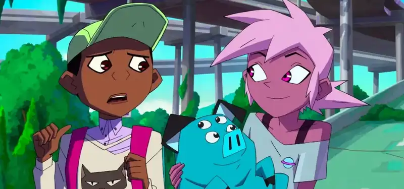
Kipo and the Age of Wonderbeasts was initially intended to be a grim, "Walking Dead"-like production. But as Radford "Rad" Secrist crafted it, he found himself weaving sweet gags and whimsical freak animal drawings into a bleak survival story. The world is apocalyptic, but the creatures that inhabit it are endearing and often benign.
In this futuristic dystopia, flora and fauna are evolving. Mutated giant animals, or "mutts," have risen to power and threaten the few remaining human beings on the planet. Kipo is a parade of anarchic designs. With angular, cartoonish characters, painterly backgrounds, and psychedelic colors, the show, which debuted its second season on Netflix this month, is unlike any other.
Except, perhaps, for Secrist's webcomic, on which the show is based. Sechrist approached DreamWorks Animation, for whom he had storyboarded numerous projects, including "Kung Fu Panda 2" and "How to Train Your Dragon 2," with the idea of adapting it into a film. Sechrist developed the show with co-writer, co-showrunner, and co-executive producer Bill Wolkoff. Seoul-based Studio Mir ("The Legend of Korra") produced the animation.
Angela Song ("The Legend of Korra," "Nico and the Sword of Light"), the show's art director, played a pivotal role in bringing the world depicted in Sechrist's comic to the screen. The aesthetics of the comics are broadly preserved, but there are definite changes. The characters have been completely redesigned. Here, of course, everything must be suitable for animation. How did Sung adopt the style he liked? From what I have seen of the original comic by Rad Secrist, the character design and palette are different from the show. To what extent did you refer to the comic during production? Angela Song: I really liked Rad's original style for Kipo, which is one of the reasons I jumped at the chance to do this (I've always been a fan of his as well). I think that style worked really well as a comic book, but adapting the story from the comic to animation is a bit of a process. For me, the most exciting aspect of animation is that I have complete creative control over what kind of experience I want the audience to have.
I prefer to use detailed design to tell a story. That is, to convince the audience that if this imaginary world existed, it would look like this. We had to do a lot of "tweaking" based on the comic in order to fully animate it.
We modified the characters to make them more sophisticated (showing form while still focusing on graphic readings) and animatable. We designed complex environments to make the post-apocalyptic world more believable. And we chose a color palette that matched the mood of the story and better tied the characters and backgrounds together.
Except for a few key locations that needed to be based on the original comics, the background team did not need to follow the comics at all. I am grateful that Rad and Bill allowed the art team almost complete freedom to design and paint the backgrounds.
What were your main inspirations and references for the backgrounds-
When I first joined the show, Rad and Bill showed me some of the concept pieces that Ryan Lang had done (they were great, and I was very impressed with them). They wanted to create a fantasy, yet post-apocalyptic look. I was very excited about the idea because I felt like what they envisioned and what I envisioned instantly matched.
In addition to these two inspirations, I asked my art team to look at movies with great layouts like "Ghost in the Shell" and "Akira". I believe that a strong foundation leads to a strong layout, and a strong layout makes the final picture more amazing and believable. This learning came from my experience working on the feature film "Kung Fu Cooking Girls" at Wolf Smoke Studios (in Shanghai), where I understood the workings of space in the background.
I think a lot of my color decisions are inspired by traditional painting. I love to play with color relationships to make images interesting, and luckily, Rad and Bill like the way I approach color too. All of the painters on the team are good at traditional painting, so it was easy for them to apply their knowledge of color to the backgrounds. They also quickly understood color styles and began to play with pushing colors and making bold decisions.
What is striking about the worldview of this series is that it is post-apocalyptic, often threatening, yet often benign. Was it difficult to strike this balance? Rudd's brilliant character designs already nailed much of that feeling. All that was left for the art team was to find a smart way to express the unique personalities of the characters. Rudd and Bill also loved the idea of having lush plants in the show, which allowed the artists to have fun with both form and color.
The colors are decidedly non-naturalistic: purple skin, blue pigs, etc. Is it difficult or easy to design a world that does not need to follow the colors of reality -
If the artists had a solid understanding of color theory and a good sense of art, it would not be difficult to choose colors that would look good. Fortunately, the three painters on the team (David Merritt, Sona Sargsyan, and Wayne Tsai) and one color designer (Catherine Tsai) were all superb.
Also, the style guide I instituted at the beginning of the show included detailed color rules, which helped a lot when hiring new artists. So even though we didn't have an exact reference, it was fun and exciting to push the colors and break what was real.
I read that when the visual references were first presented to you, the Meer team said it would be difficult to animate this show. Why did they think so? And how did they make it less difficult? If anything, I would guess that it was probably the unique character designs that made them think so. Unlike other shows where humans and regular animals make up the majority of characters, "Keepo" has many unique creatures (such as the mega-rabbit with more than 10 ears and many legs).
One might find it difficult to imagine how they move and interact with each other. However, Rad, a superb figure drawing artist and character designer, really helped the Mir team by drawing a breakdown of what he imagined the characters' forms and volumes to look like.
Tell us about your working relationship with Mir. What kind of direction did you give them? Once production started, our line producer Michael Moragne coordinated everything with Mir, including bi-weekly meetings. Whenever we received the final animations for an episode, storyboard supervisor Yong Ki Yoon was the main person on our side to give us direction. Rad, Bill, and I would also look at it and give feedback. I don't recall any surprising difficulties in this process.
Their determination and dedication to making the show look good surprised me, though. Lim Kyung Hwa, Meer's art director, was absolutely fantastic. She asked the right questions about our approach to color and style, and she took that information seriously and implemented it. After meeting every other week for the first 10 episodes, it was mutually decided that they didn't need any more guidance from us, so in the end all we did was keep looking at the final animations that were sent to us.
.
Post your comment